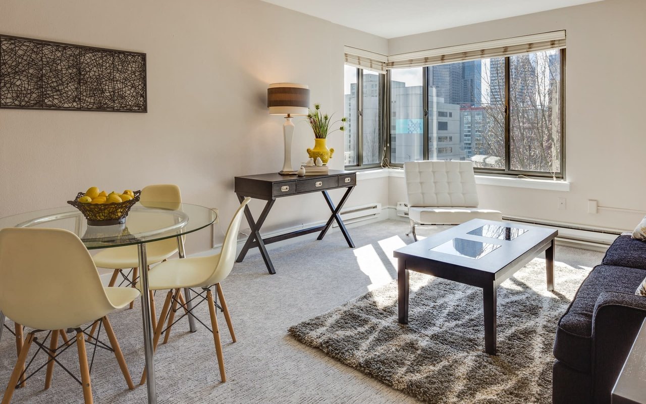
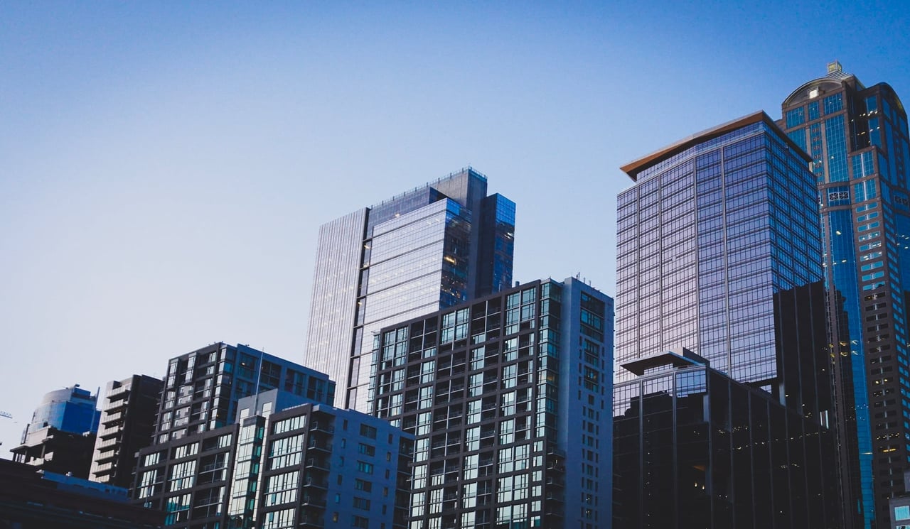
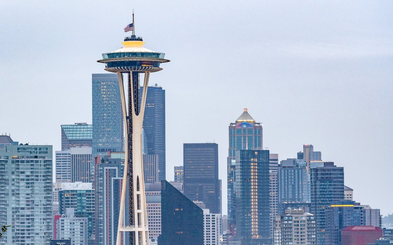
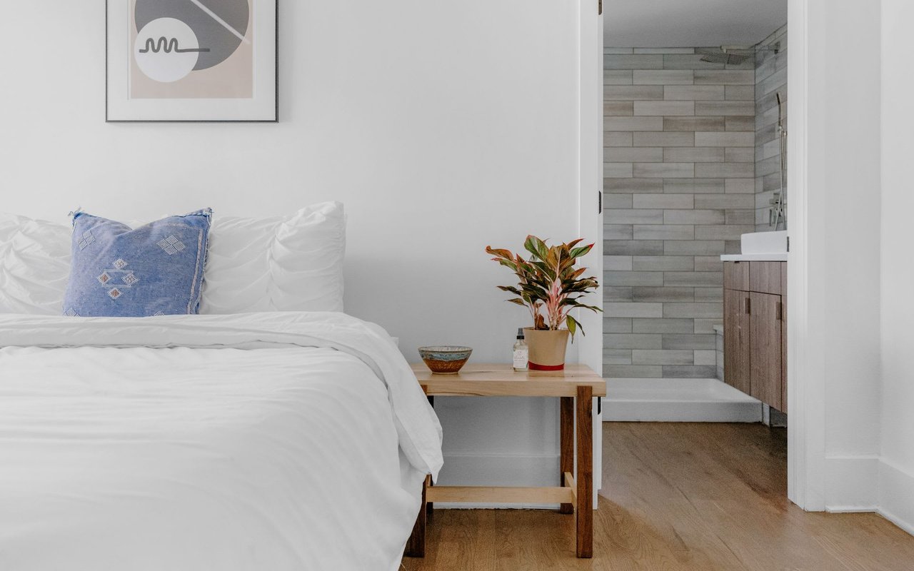
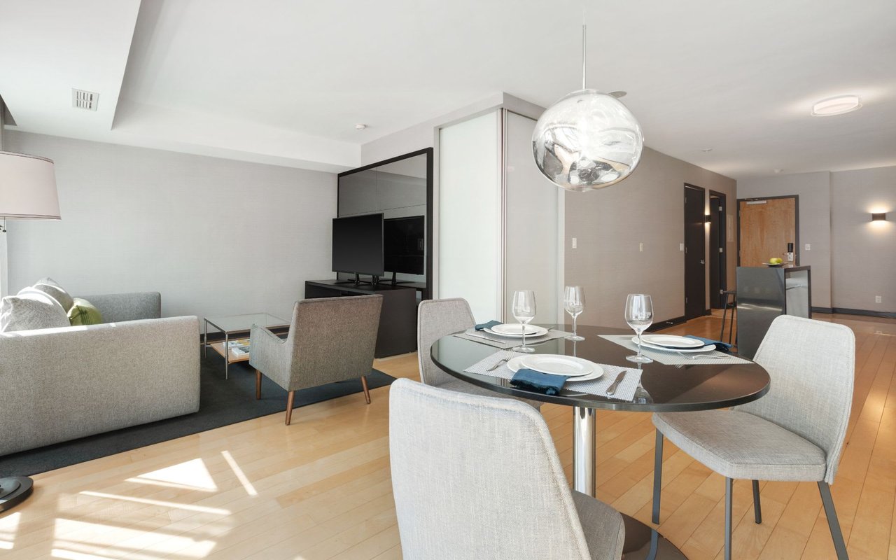
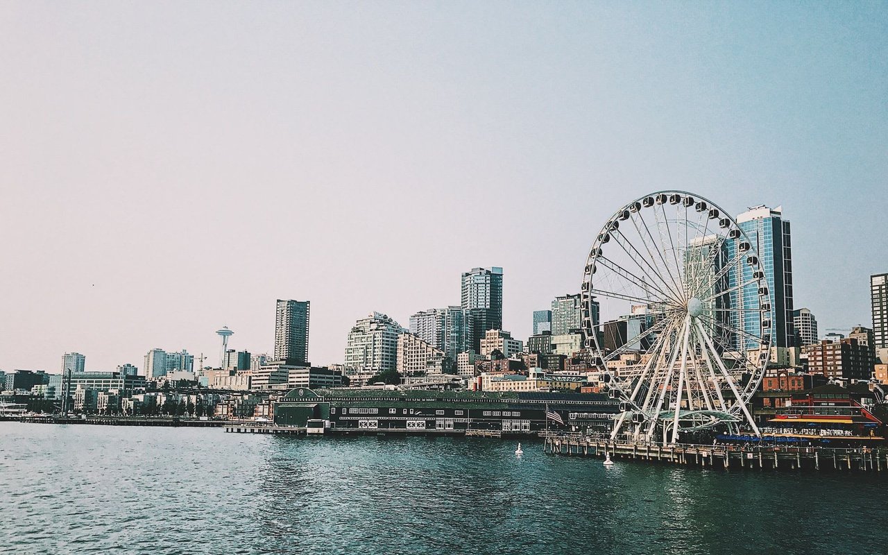
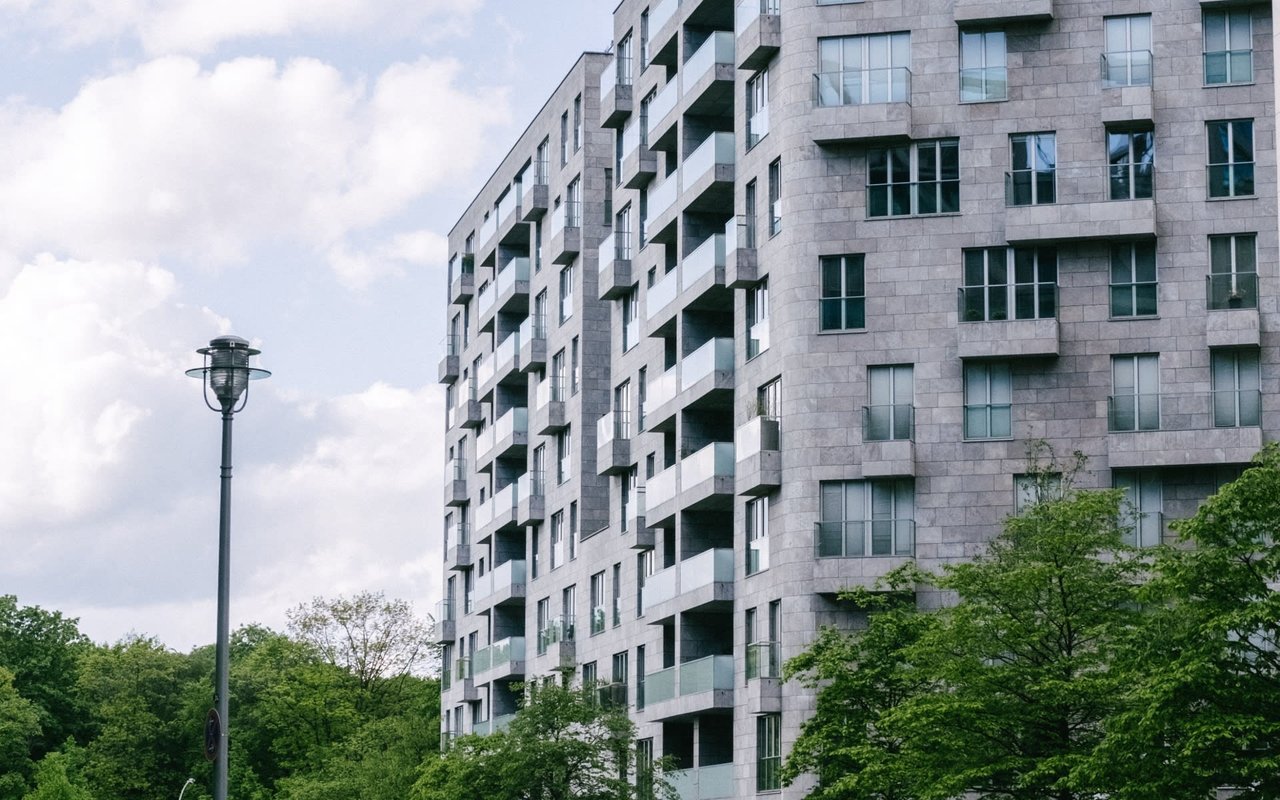
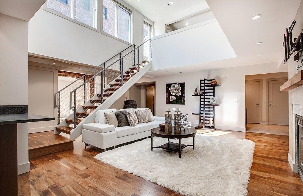
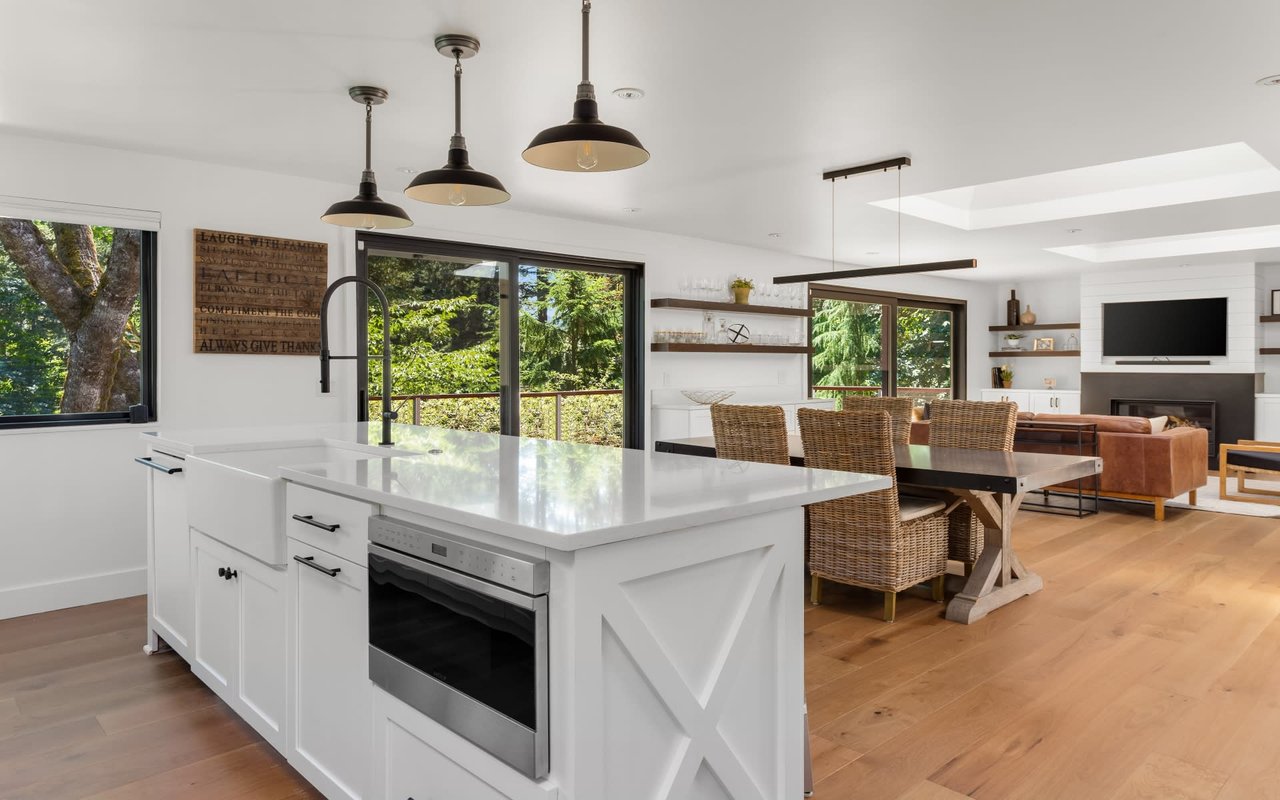
Pet-Friendly Condos in Seattle: Best Buildings for You and Your Furry Friend
- Jeff Reynolds
- 12/1/25
Navigating the best pet-friendly building in Seattle's high-end luxury condo market.
Read MORE
Best Coffee Shops in Seattle
- Jeff Reynolds
- 11/21/25
These cafes are worthy of Seattle’s reputation for great coffee.
Read MORE
Most Googled Questions about Real Estate in 2025
- Jeff Reynolds
- 10/27/25
Your 2025 Real Estate Questions, Answered in One Place.
Read MORE
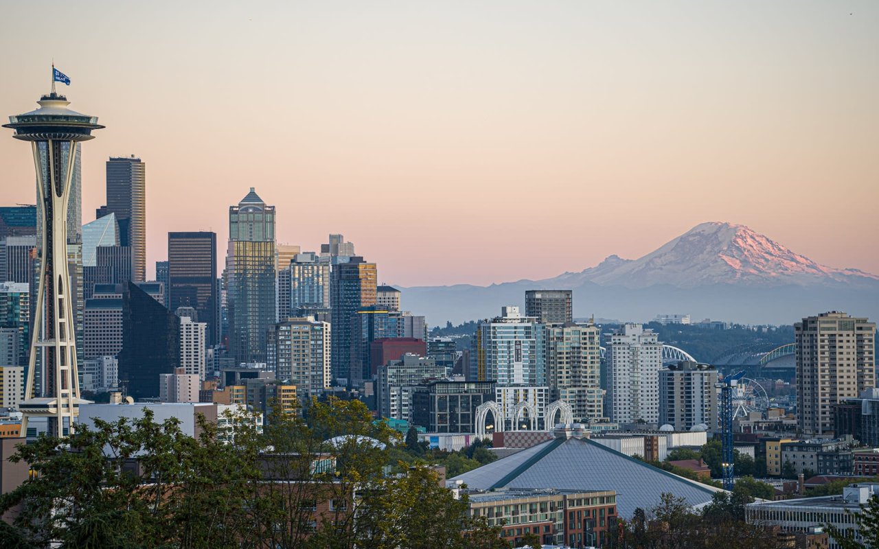
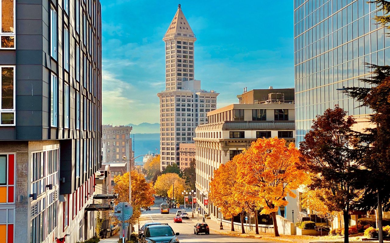
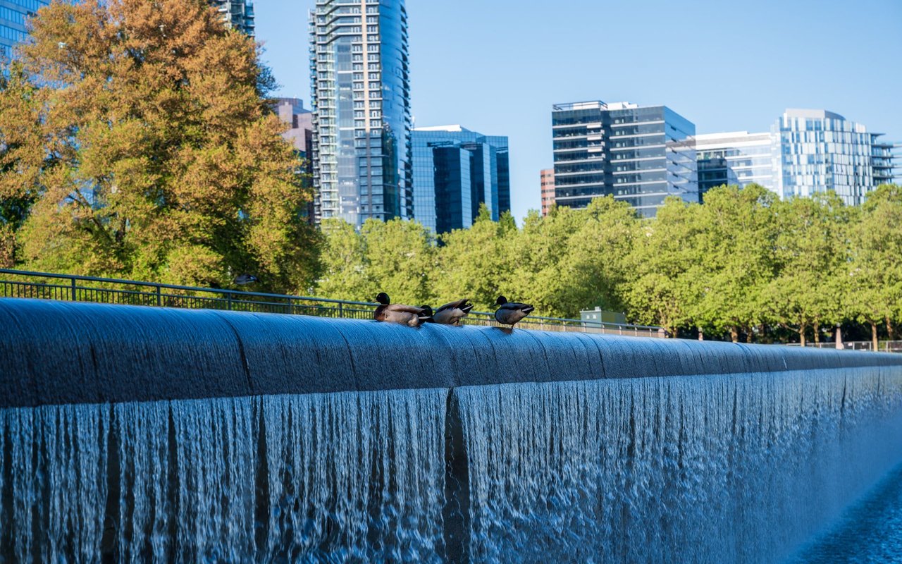
Things to do in Seattle
- Jeff Reynolds
- 10/27/25
Discover the Emerald City's Most Unforgettable Attractions.
Read MORE
Do You Need a Home Warranty?
- Jeff Reynolds
- 09/12/25
Understanding How Warranties Can Protect Seattle Condo Owners.
Read MORE
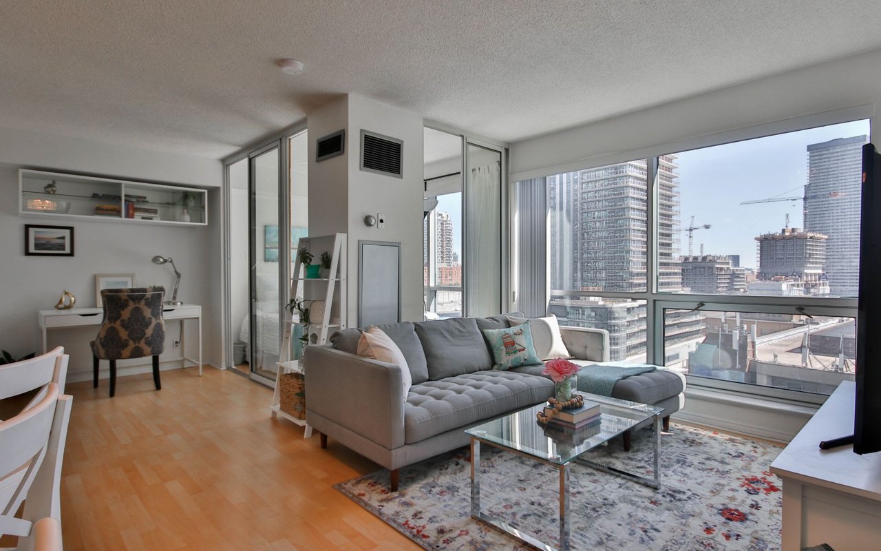
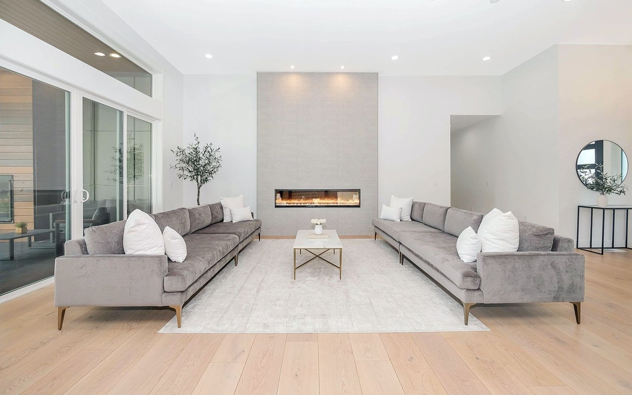
Downtown vs. Waterfront Condos: Which Seattle Location is Best for You?
- Jeff Reynolds
- 09/12/25
Comparing Two Distinct Condo Lifestyles in the Heart of Seattle.
Read MORE
10 Things To Do When Moving To A New State
- Jeff Reynolds
- 09/12/25
Steps to make your condo relocation smooth and stress-free.
Read MORE
Weekend Trips from Seattle
- Jeff Reynolds
- 09/12/25
Discover Scenic Escapes Just a Short Drive or Ferry Ride Away.
Read MORE
How to Find a Real Estate Broker
- Jeff Reynolds
- 07/17/25
A Smart Guide for Seattle Buyers and Sellers.
Read MORE
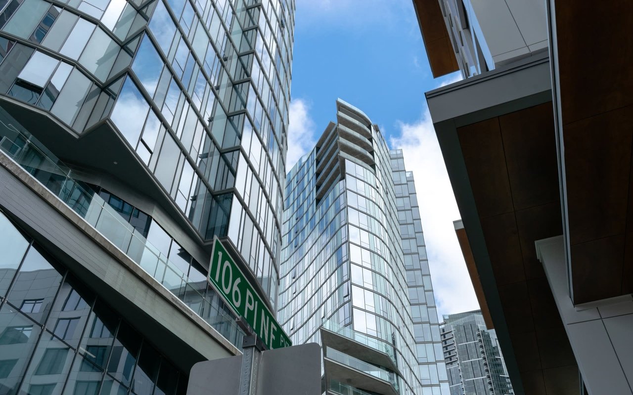
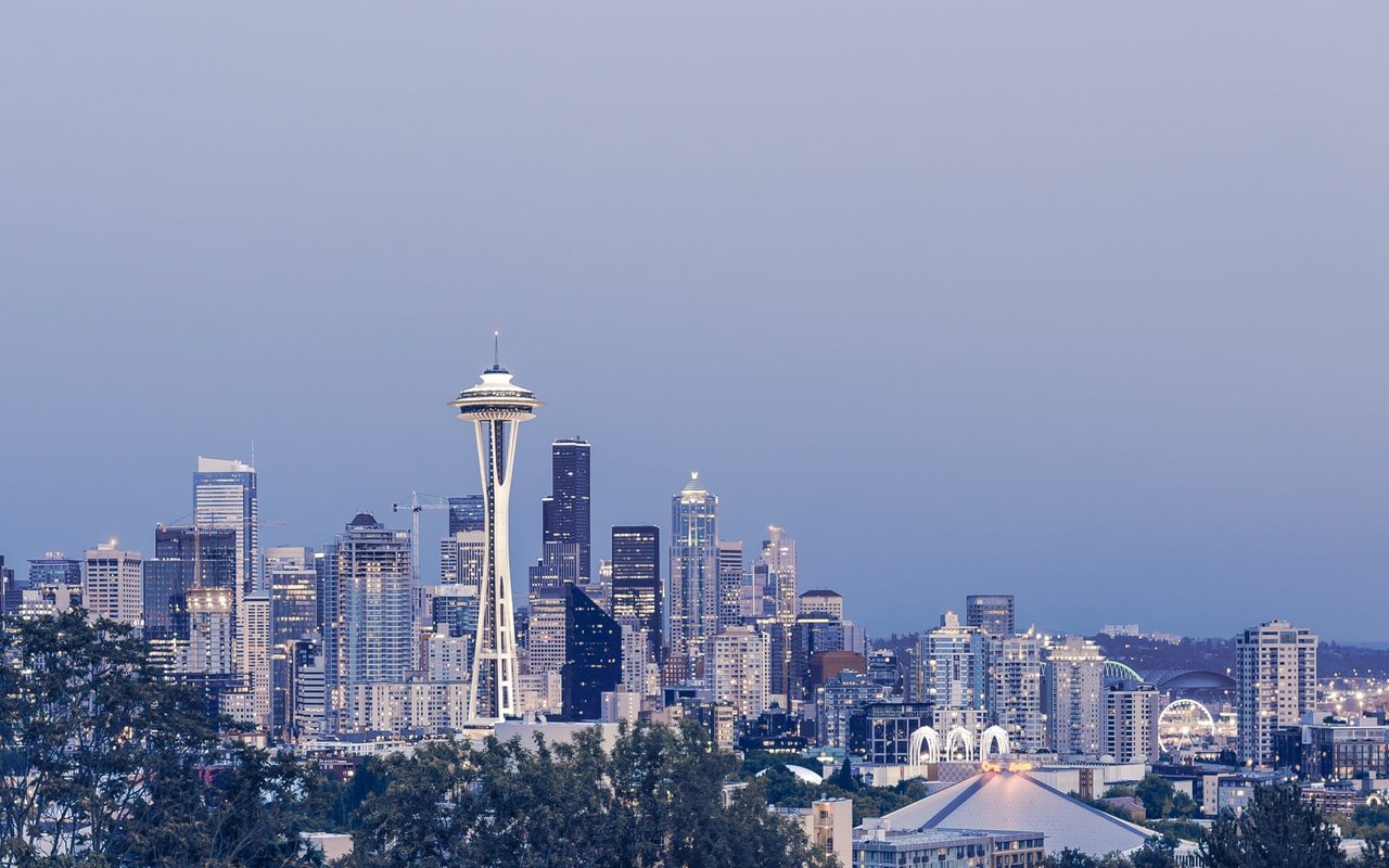
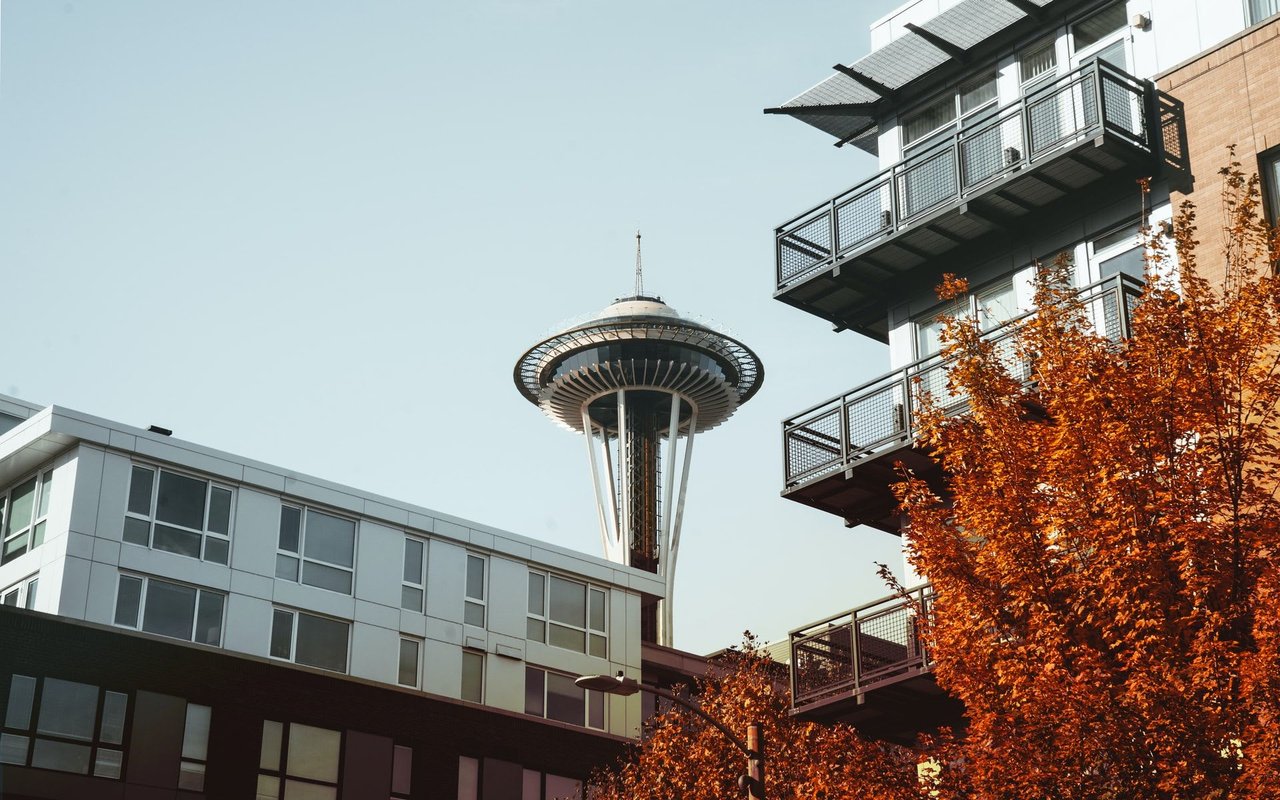
Moving to Seattle
- Jeff Reynolds
- 07/17/25
What You Need to Know Before Calling the Emerald City Home.
Read MORE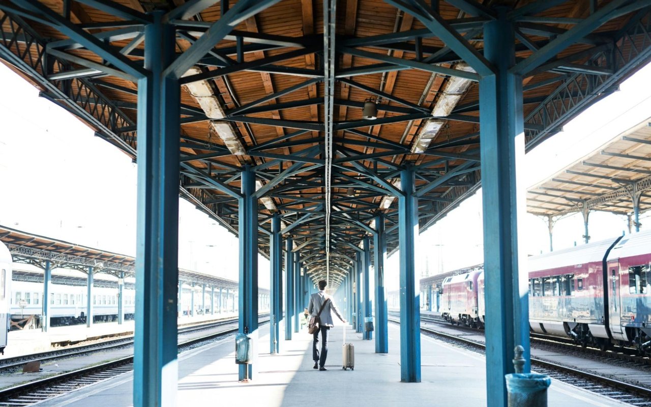
Hidden Perks of Living Near the Bellevue Light Rail: Walkability, Convenience, and More
- Jeff Reynolds
- 07/9/25
Exploring the Lifestyle Benefits of Bellevue’s Growing Transit Access.
Read MORE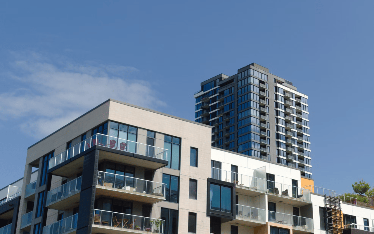
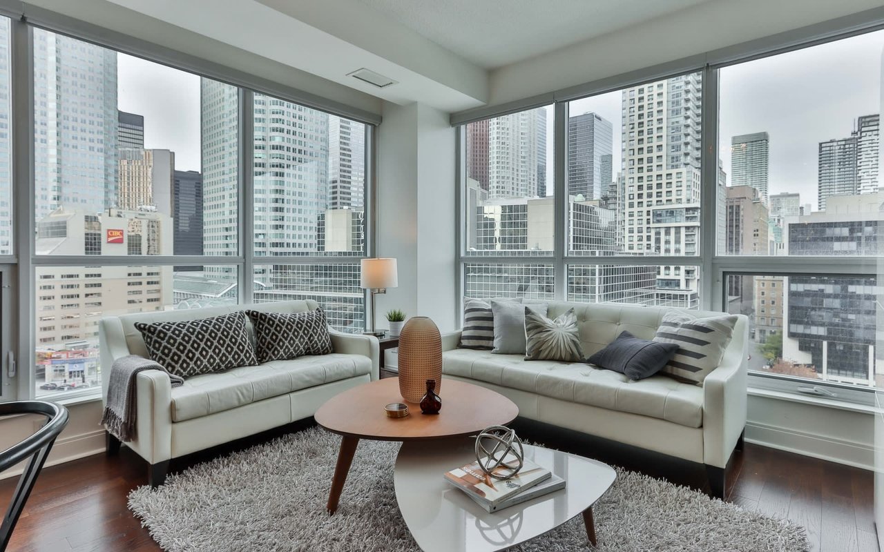
Condo HOA Fees in Seattle: What to Expect and How to Budget
- Jeff Reynolds
- 06/23/25
What Seattle Condo Buyers Need to Know About Monthly Costs and Financial Planning.
Read MORE
Condos vs. Single-Family Homes: The Bellevue Light Rail’s Impact on Housing Demand
- Jeff Reynolds
- 06/11/25
How the 2 Line Is Shaping Buyer Preferences in Bellevue’s Evolving Market.
Read MORE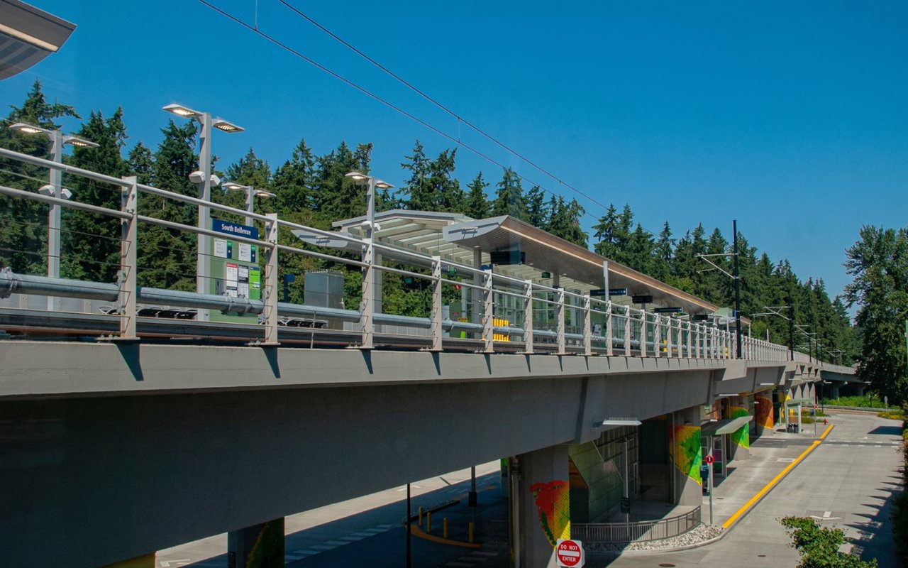
Bellevue’s Hottest Neighborhoods Near the Light Rail: Where to Buy Now
- Jeff Reynolds
- 06/10/25
Explore neighborhoods with real estate near light rail stations.
Read MORE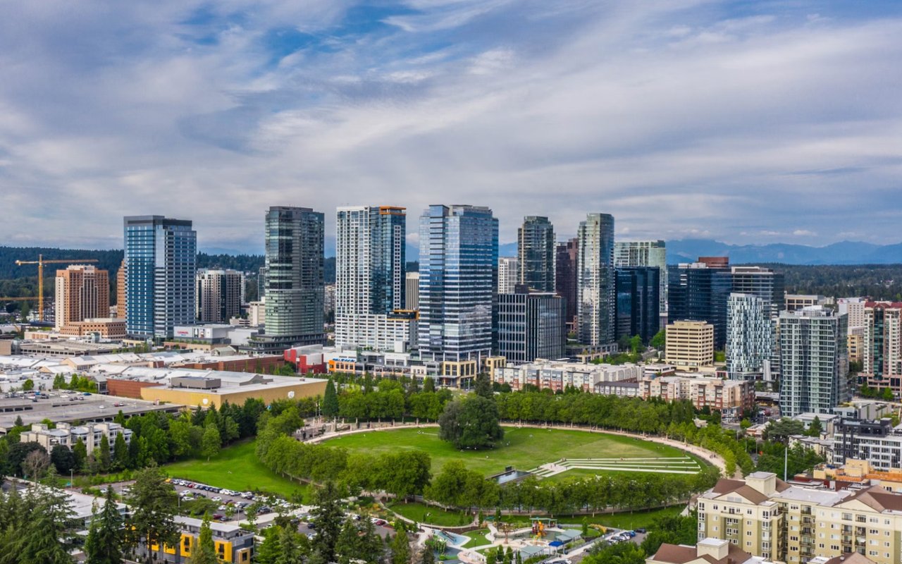
How the Bellevue Light Rail Is Transforming Home Values on the Eastside
- Jeff Reynolds
- 06/10/25
What the East Link Means for Your Bellevue Real Estate Investment.
Read MORE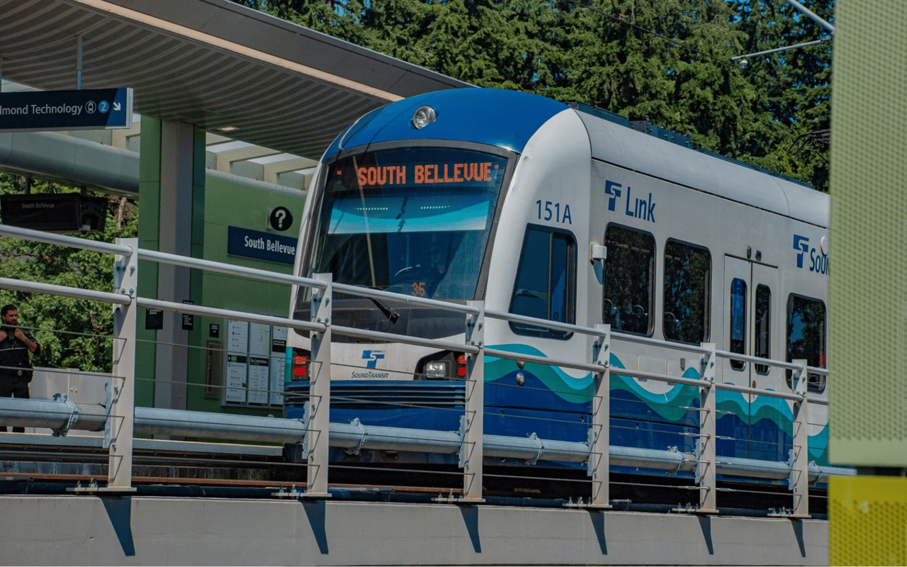
Why Real Estate Investors Are Betting Big on Bellevue’s Light Rail Expansion
- Jeff Reynolds
- 05/1/25
Bellevue’s light rail isn’t just changing how people travel — it’s changing where they want to live.
Read MORE
Real Estate Negotiation Strategies From An Expert
- Jeff Reynolds
- 03/4/25
With top-tier negotiation on your side, your real estate goals are within reach.
Read MORE
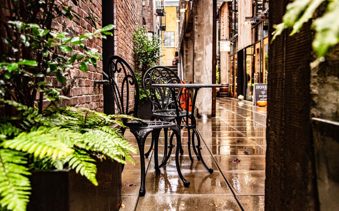
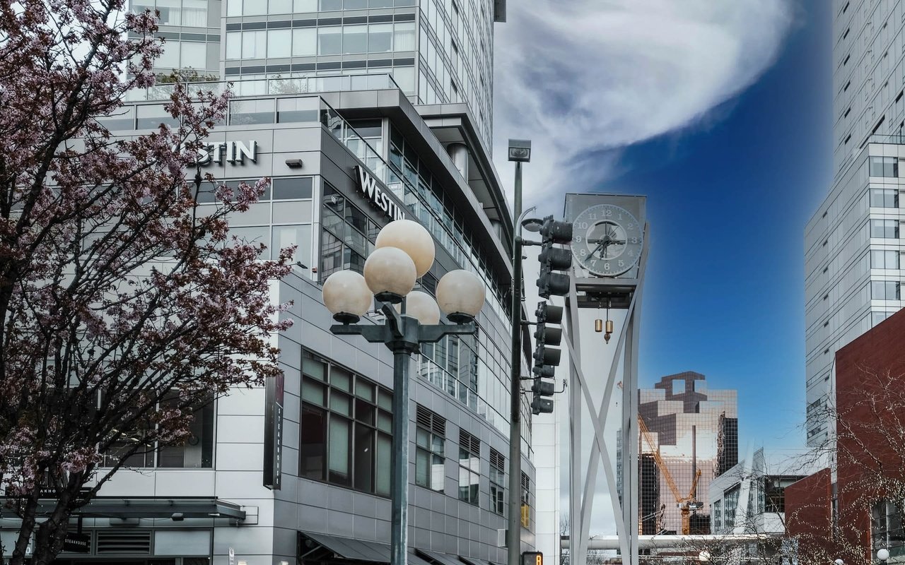
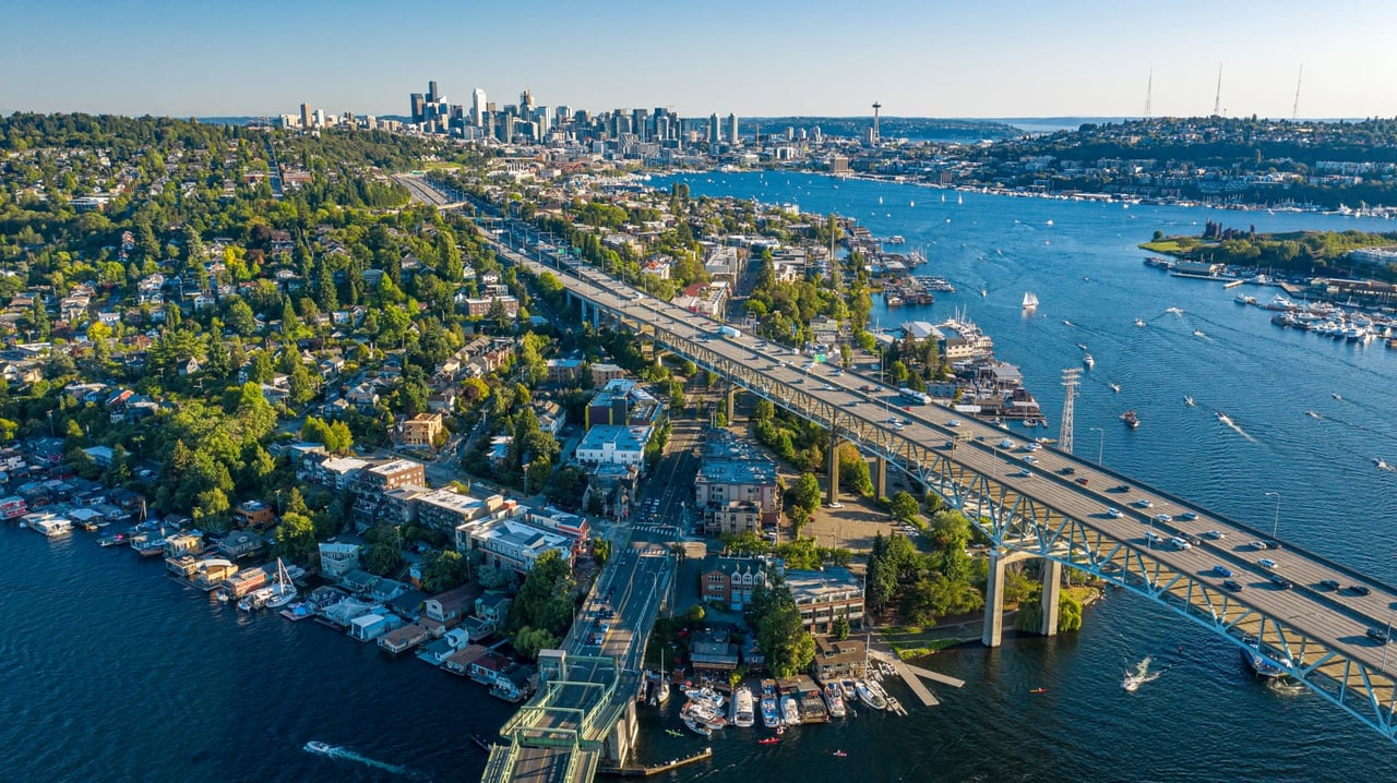
Things You Might Not Know About Seattle
- Jeff Reynolds
- 03/3/25
These new dimensions will expand your thinking about Seattle.
Read MORE
Tips for Hiring a Remodeling Contractor
- Jeff Reynolds
- 02/6/25
Transforming your home starts with choosing the right professional.
Read MORE
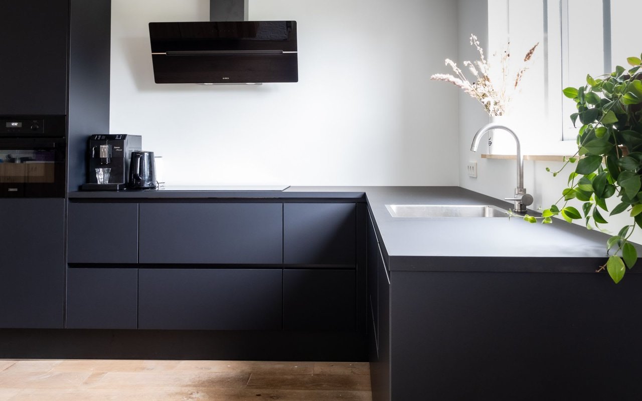
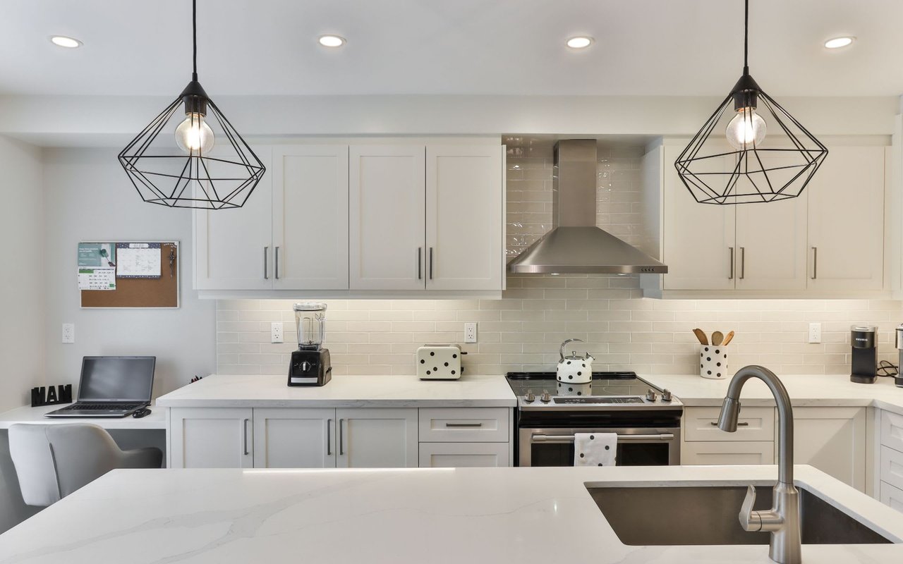
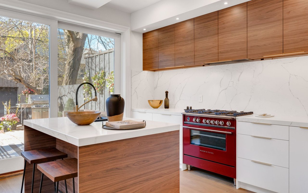
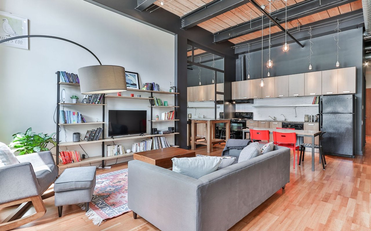
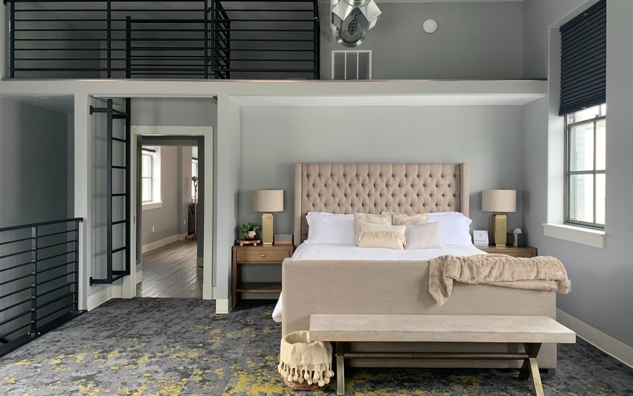
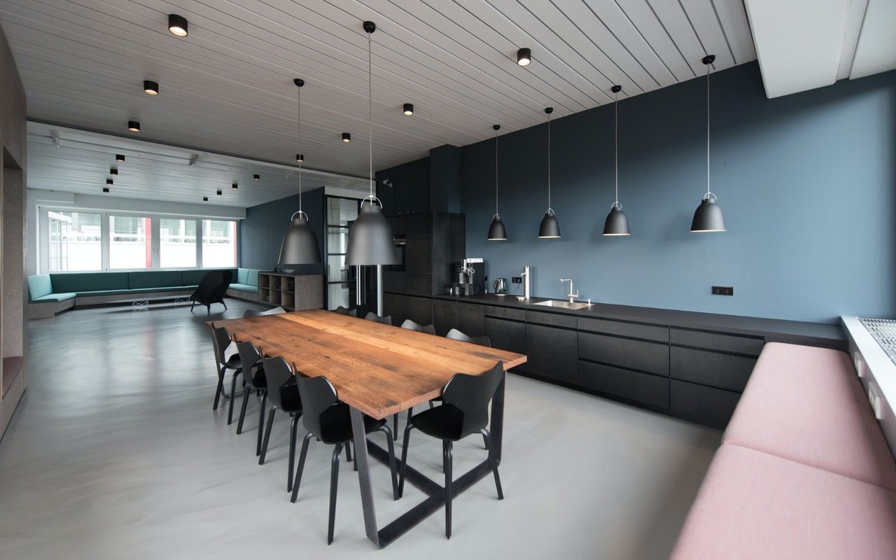
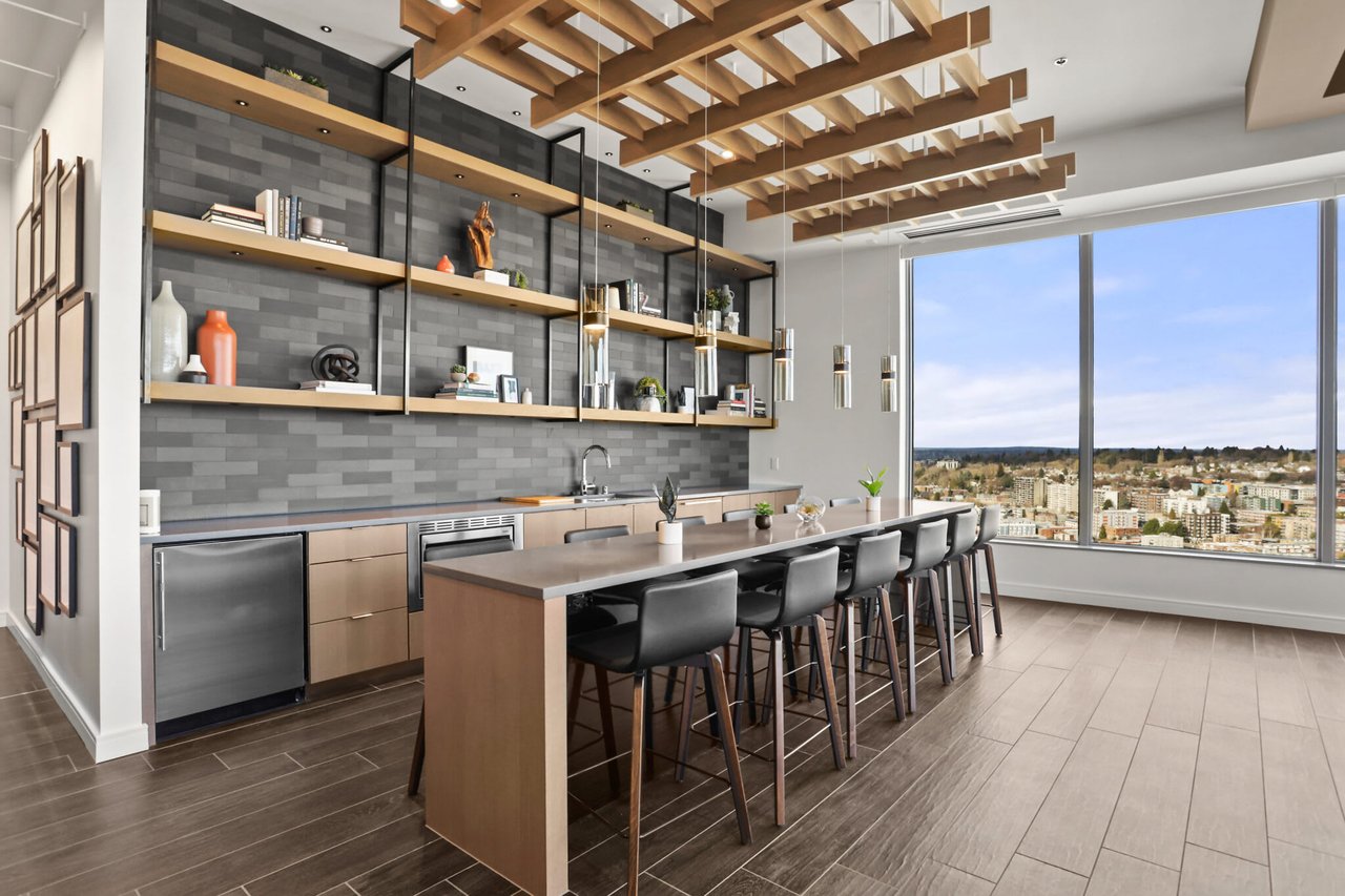
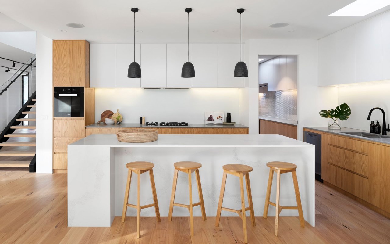
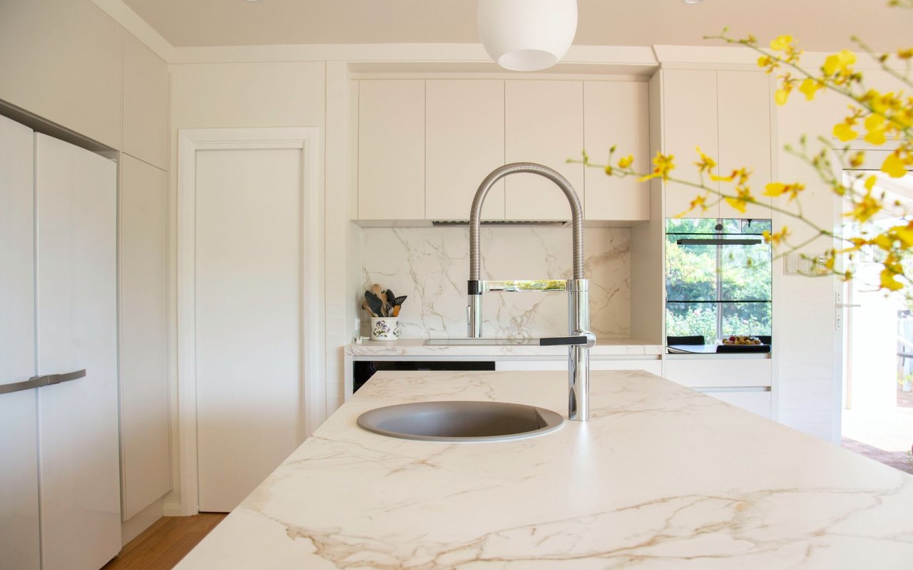
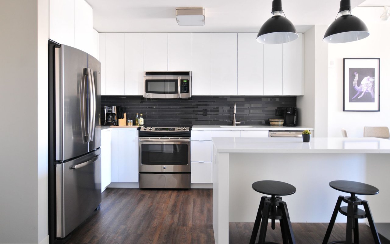
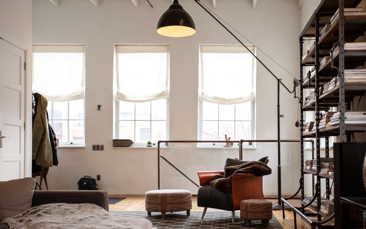
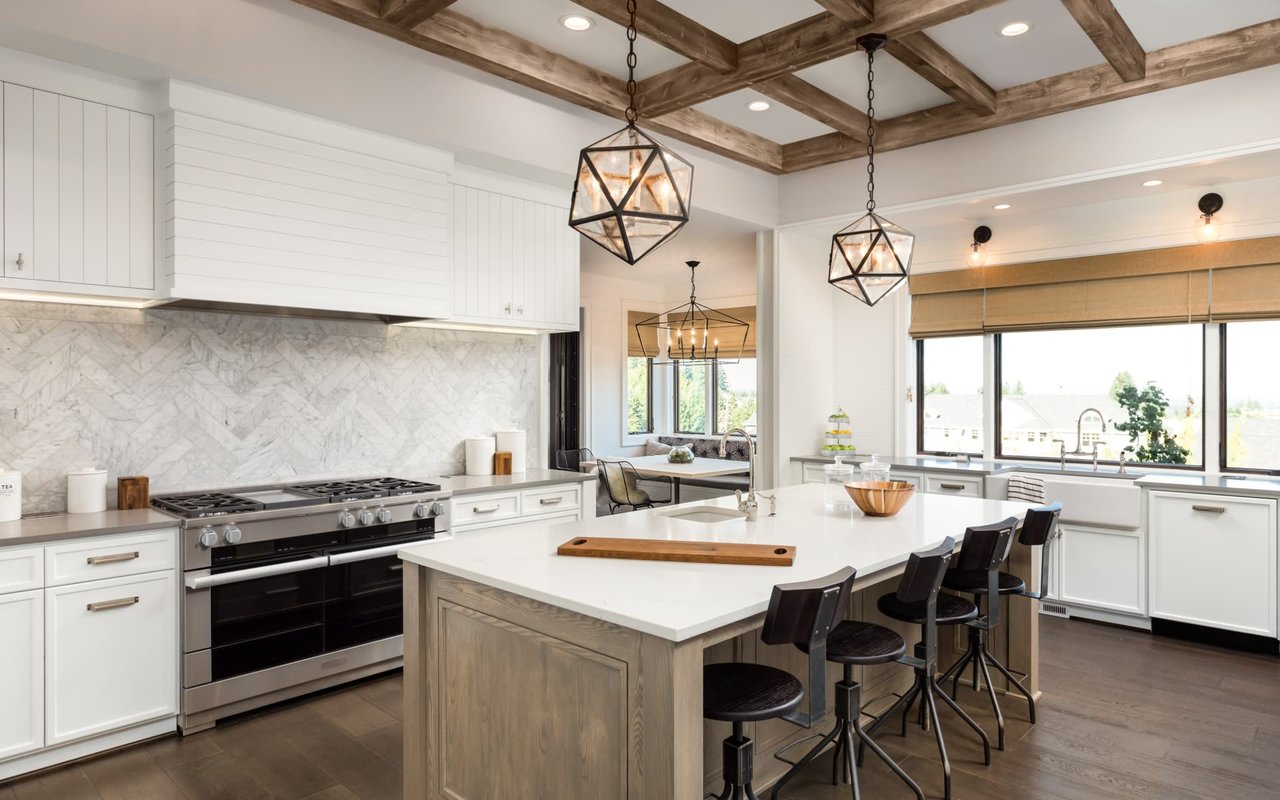
Condo Upgrade Ideas
- Jeff Reynolds
- 01/27/25
Elevate your living space and make your condo the perfect urban retreat.
Read MORE